from math import Dimensionality_Reduction
What’s inside this Book Chapter :
This blog is a detailed , yet lucid overview of the book chapter , “High Dimensionality Dataset Reduction Methodologies in Applied Machine Learning” from the “Taylor and Francis Book Publication (Routledge)” for the book “Data Science and Data Analytics: Opportunities and Challenges 2020”.
Read the Chapters in Detail :
Farhan Hai Khana, Tannistha Palb
a. Department of Electrical Engineering, Institute of Engineering & Management, Kolkata, India, njrfarhandasilva10@gmail.com
b. Department of Electronics and Communication Engineering, Institute of Engineering & Management, Kolkata, India, paltannistha@gmail.com
Abstract
A common problem faced while handling multi-featured datasets is the high amount of dimensionality that they often consist of, leading to barriers in generalized hands-on Machine Learning. These datasets also give a drastic impact on the performance of Machine Learning algorithms, being memory inefficient and frequently leading to model overfitting. It often becomes difficult to visualize or gain insightful knowledge on the data features such as presence of outliers.
This chapter will help data analysts reduce data dimensionality using various methodologies such as:
- Feature Selection using Covariance Matrix
- t-distributed Stochastic Neighbour Embedding (t-SNE)
- Principal Component Analysis (PCA)
Under applications of Dimensionality Reduction Algorithms with Visualizations, firstly, we introduce the Boston Housing Dataset and use the Correlation Matrix to apply Feature Selection on the strongly correlated data and perform Simple Linear Regression over the new features. Then we apply t-SNE to MNIST Handwritten Digits Dataset and use k-Nearest Neighbours (kNNs) clustering for classification. Lastly, use UCI Breast Cancer Dataset to perform PCA Analysis with Support Vector Machine (SVM) Classification. Finally, we explore the benefits of using Dimensionality Reduction Methods and provide a comprehensive overview of reduction in storage space, efficient models,feature selection guidelines, redundant data removal and outlier analysis.
Keywords : Dimensionality Reduction, Feature Selection, Covariance Matrix, PCA , t-SNE
1. Problems faced with High Dimensionality Data : An Introduction
"Dimensionality Reduction leads to a comprehensive, precise & compressed depiction of the target output variables, by reducing redundant input variables."- Farhan Khan & Tannistha Pal.
In the field of artificial intelligence, data explosion has created a plethora of input data & features to be fed into machine learning algorithms. Since most of the real-world data is multi-dimensional in nature, data scientists & data analysts require the core concepts of dimensionality reduction mechanisms for better :
(i) Data Intuition : Visualization, Outlier Detection & Noise Reduction
(ii) Performance Efficiency : Faster Training Intervals & Reduced Computational Processing Time
(iii) Generalization : Prevents Overfitting (High Variance & Low Bias)
This chapter introduces the practical working implementation of these reduction algorithms in applied machine learning.
Multiple features make it difficult to obtain valuable insights into data, as the visualization plots obtained can be 3-Dimensional at most. Due to this limitation, dependent properties/operations such as Outlier Detection and Noise Removal become more and more non-intuitive to perform on these humongous datasets. Therefore, applying dimensionality reduction helps in identifying these properties more effortlessly.
Due to this reduced/compressed form of data, faster mathematical operations such as Scaling, Classification, Regression can be performed. Also, the data is more clean and this further solves the issues of overfitting a model.
Dimensionality Reduction can be broadly classified into :
(i) Feature Selection Techniques : Feature Selection attempts to train the machine learning model by selectively choosing a subset of the original feature set based on some criteria. Hence, redundant and obsolete characteristics could be eliminated without much information loss. Examples - Correlation Matrix Thresholding & Chi Squared Test Selection.
(ii) Feature Extraction/Projection Techniques : This method projects the original input features from the high dimensional space by summarizing most statistics and removing redundant data / manipulating to create new relevant output features with reduced dimensionality (fewer dimensional space). Examples - Principle Component Analysis (PCA) , Linear Discriminant Analysis (LDA), t-distributed Stochastic Neighbour Embedding(t-SNE) & Isometric Mapping (IsoMap).
However, we have limited our discussion to Correlation Matrices, PCA & t-SNE only, as covering all such techniques is beyond the scope of this book chapter.
2. Dimensionality Reduction Algorithms with Visualizations
2.1 Feature Selection using Covariance Matrix
Objective : Introduce Boston Housing Dataset and use the obtained Correlation Matrix to apply Feature Selection on the strongly positive correlated data and perform Regression over the selective features.
2.1.1 Importing the Modules
We will need 3 datasets for this chapter, each of which have been documented on our github repository. Hence we will create a local copy (clone) of that repo here.
!git clone https://github.com/khanfarhan10/DIMENSIONALITY_REDUCTION.git
Cloning into 'DIMENSIONALITY_REDUCTION'...
remote: Enumerating objects: 14, done.[K
remote: Counting objects: 100% (14/14), done.[K
remote: Compressing objects: 100% (12/12), done.[K
remote: Total 14 (delta 1), reused 0 (delta 0), pack-reused 0[K
Unpacking objects: 100% (14/14), done.
Firstly we will import all the necessary libraries that we will be requiring for Dataset Reductions.
import numpy as np               # Mathematical Functions , Linear Algebra, Matrix Operations
import pandas as pd              # Data Manipulations,  Data Analysis/Storing/Preparation
import matplotlib.pyplot as plt  # Simple Data Visualization , Basic Plotting Utilities
plt.style.use("dark_background") #just a preference of the authors, adds visual attractiveness
import seaborn as sns            # Advanced Data Visualization, High Level Figures Interfacing
%matplotlib inline
# used for Jupyter Notebook Plotting
#%matplotlib notebook            # This can be used as an alternative as the plots obtained will be interactive in nature.
Initial Pseudo Random Number Generator Seeds:
In Applied Machine Learning, it is essential to make experiments reproducable and at the same time keeping weights as completely random. The Seed of a Pseudo Random Number Generator (PRNG) acheives the exact same task by initializing values with the same conditions everytime a program is executed. We have used a constant value (universal seed) of 42 throughout the course of this chapter.
univ_seed=42
np.random.seed(univ_seed)
2.1.2 The Boston Housing Dataset
The Dataset is derived from information collected by the U.S. Census Service concerning housing in the area of Boston Mass. The Boston dataframe has 506 rows and 14 columns. The MEDV variable is the target variable.
Columns / Variables in order:
CRIM- per capita crime rate by townZN- proportion of residential land zoned for lots over 25,000 sq.ft.INDUS- proportion of non-retail business acres per townCHAS- Charles River dummy variable (= 1 if tract bounds river; 0 otherwise)NOX- nitric oxides concentration (parts per 10 million)RM- average number of rooms per dwellingAGE- proportion of owner-occupied units built prior to 1940DIS- weighted distances to five Boston employment centresRAD- index of accessibility to radial highwaysTAX- full-value property-tax rate per $10,000PTRATIO- pupil-teacher ratio by townB- \(1000*(B_{k} - 0.63)^{2}\) where \(B_{k}\) is the proportion of blacks by townLSTAT- % lower status of the populationMEDV- Median value of owner-occupied homes in $1000’s
Importing the dataset :
from sklearn.datasets import load_boston         # scikit learn has an inbuilt dataset library which includes the boston housing dataset
boston_dataset = load_boston()                   # the boston_dataset is a dictionary of values containing the data
df = pd.DataFrame(boston_dataset.data, columns=boston_dataset.feature_names)  # creating a dataframe of the boston_dataest
df['MEDV'] = boston_dataset.target               # adding the target variable to the dataframe
df.head(4)                                       # printing the first 4 columns of the dataframe
| CRIM | ZN | INDUS | CHAS | NOX | RM | AGE | DIS | RAD | TAX | PTRATIO | B | LSTAT | MEDV | |
|---|---|---|---|---|---|---|---|---|---|---|---|---|---|---|
| 0 | 0.00632 | 18.0 | 2.31 | 0.0 | 0.538 | 6.575 | 65.2 | 4.0900 | 1.0 | 296.0 | 15.3 | 396.90 | 4.98 | 24.0 |
| 1 | 0.02731 | 0.0 | 7.07 | 0.0 | 0.469 | 6.421 | 78.9 | 4.9671 | 2.0 | 242.0 | 17.8 | 396.90 | 9.14 | 21.6 |
| 2 | 0.02729 | 0.0 | 7.07 | 0.0 | 0.469 | 7.185 | 61.1 | 4.9671 | 2.0 | 242.0 | 17.8 | 392.83 | 4.03 | 34.7 |
| 3 | 0.03237 | 0.0 | 2.18 | 0.0 | 0.458 | 6.998 | 45.8 | 6.0622 | 3.0 | 222.0 | 18.7 | 394.63 | 2.94 | 33.4 |
Library Information :
The variable boston_dataset is python dictionary returned via the scikit-learn library with the following keys:
- data : The input values of the dataset.
- target : The output variable of the dataset.
- feature_names : The name of the feature variables as an array.
- DESCR : A brief description of the dataset.
- filename : Local location of the file with it’s full path.
You can access each key’s values using boston_dataset.key_name as we used to create a pandas dataframe. You can read the official scikit learn datasets documentation and get to know about embedded datasets.
Alternatively :
You can also run the following code, provided you have cloned our github repository.
df= pd.read_excel("/content/DIMENSIONALITY_REDUCTION/data/Boston_Data.xlsx")
Also, with a working internet connection, you can run :
df= pd.read_excel("https://raw.githubusercontent.com/khanfarhan10/DIMENSIONALITY_REDUCTION/master/data/Boston_Data.xlsx")
–OR–
df= pd.read_excel("https://github.com/khanfarhan10/DIMENSIONALITY_REDUCTION/blob/master/data/Boston_Data.xlsx?raw=true")
Data Insights :
You might want to try df.isnull().sum() , df.info() , df.describe() to get the columnwise null values, dataframe information and row-wise description respectively. However , here the data provided is clean and free from such issues which would be needed to be processed/handled inspectionally.
2.1.3 Perform Basic Data Visualization
Data Visualization is the key to visual data insights and can provide useful analytics about the data. Here in the following code snippet, we will find out the distribution of each columns (feature & target) in the data.
df.hist(bins=30,figsize=(20,10),grid=False,color="crimson"); # distribution of each column
Data Visualization Tips :
For more color palettes visit : Matplotlib Named Colours.
Almost all the visualizations used in this chapter from Pandas and Seaborn can be saved to high quality pictures using plt.savefig("fig_name.png",dpi=600)
2.1.4 Pearson Coefficient Correlation Matrix
The Pearson Correlation Coefficient (also known as the Pearson R Test) is a very useful statistical formulae that measures the strength between features and relations.
Mathematically,
\[r_{xy}=\frac{N \Sigma x y-(\Sigma x)(\Sigma y)}{\sqrt{\left[N \Sigma x^{2}-(\Sigma x)^{2}\right]\left[N \Sigma y^{2}-(\Sigma y)^{2}\right]}}\]where
\(r_{xy}\) = Pearson’s Correlation Coefficient between variables x & y
\(N\) = number of pairs of x & y variables in the data
\(\Sigma x y\) = sum of products between x & y variables
\(\Sigma x\) = sum of x values
\(\Sigma y\) = sum of y values
\(\Sigma x^{2}\) = sum of squared x values
\(\Sigma y^{2}\) = sum of squared y values
For all feaure variables \(f_{i}\) \(\epsilon\) \(F\) arranged in any order , with \(n(F) = N\)
The Correlation Coefficient Matrix is \(M_{N \times N}\) , where
\(M_{ij}\) = \(r_{ij}\) , \(i,j\) \(\epsilon\) \(F\)
We will now use Pandas to get the correlation matrix and plot a heatmap using Seaborn.
correlation_matrix = df.corr().round(2) #default method = ‘pearson’, also available : ‘kendall’, ‘spearman’ correlation coefficients
plt.figure(figsize=(20,10)) #set the figure size to display
sns.heatmap(data=correlation_matrix,cmap="inferno", annot=True)  # annot = True to print the values inside the squares
plt.savefig("Correlation_Data.png",dpi=600)
2.1.5 Detailed Correlation Matrix Analysis
The correlation coefficient ranges from -1 to 1. If the value is close to 1, it means that there is a strong positive correlation between the two variables and both increase or decrease simultaneously. When it is close to -1, the relationship between the variables is negatively correlated, or as one value increases, the other decreases.
Observations:
To fit a linear regression model, we select those features which have a high correlation with our target variable MEDV. By looking at the correlation matrix we can see that RM has a strong positive correlation with MEDV (0.7) where as LSTAT (-0.74) has a high negative correlation with MEDV. An important point in selecting features for a linear regression model is to check for Multi Collinearity : features that are strongly correlated to other features and are therefore redundant. The features RAD, TAX have a correlation of 0.91. These feature pairs are strongly correlated to each other . We should not select both these features together for training the model. The same goes for the features DIS and AGE which have a correlation of -0.75. Except for a manual analysis of the correlation, the function below computes the strongly correlated features to the target variable MEDV :
thres_range=(-0.7,0.7)  # provide the upper and lower limits for thresholding the strongly correlated features
target_variable="MEDV"  # provide the target variable name

def get_strong_corr(correlation_matrix,target_variable,thres_range=(-0.65,0.65)):
  """
  Get the strongly positive and strongly negatively correlated components from the provided correlation matrix.
  Assigns values inside boundary to 0 and returns non zero entries as a Pandas Series.
  correlation_matrix : The correlation matrix obtained from the data.
  target_variable    : The name of the target variable that we need to calculate the correlation for.
  thres_range        : The thresholding range for the calculation of strongly correlated data.
  """
  thres_min,thres_max=thres_range                                       # assign minimum and maximum values passed to threshold
  target_row=correlation_matrix[target_variable]                        # get the row with the target variable name
  target_row[(target_row > thres_min) & (target_row < thres_max)]=0     # assign values out of given threshold to zero
  indices_thresholded=target_row.to_numpy().nonzero()                   # remove the zero values from the filtered target row and get indices
  strong_corr=list(correlation_matrix.columns[indices_thresholded])     # extract feature names from their respective indices
  if target_variable in strong_corr: strong_corr.remove(target_variable)# correlation of target variable with itself is always 1, remove it.
  return target_row[strong_corr]                                        # return the strongly correlated features with their values

strong_corr=get_strong_corr(correlation_matrix,target_variable,thres_range)
print(strong_corr)
RM       0.70
LSTAT   -0.74
Name: MEDV, dtype: float64
Python Code Documentation - Docstrings :
Triple quoted strings ("""String""") after a function declaration in Python account for a function’s documentation and are referred to as Docstrings. These can be retrieved later and add the advantage of asking help towards the working of a function.
Create Docstring :
def function_name(arguments):
"""Function Documentation""""
Retrieve Helper Docstring :
help(function_name)
For information about Docstrings visit : Docstring Conventions. For example you could run the following command:
help(get_strong_corr)
Based on the above observations and discussions we will use RM and LSTAT as our features. Using a scatter plot let’s see how these features vary with MEDV.
plt.figure(figsize=(25,10))                                    # initialize the figure with a figure size

features = ['LSTAT', 'RM']                                     # features to display over the dataset

for i, col in enumerate(features):                             # loop over the features with count
    plt.subplot(1, len(features) , i+1)                        # subplotting
    x = df[col]                                                # getting the column values from the dataframe
    plt.scatter(x, target, marker='o',color="cyan")            # performing a scatterplot in matplotlib over x & target
    plt.title("Variation of "+target_variable+" w.r.t. "+col)  # setting subplot title
    plt.xlabel(col)                                            # setting the xlabels and ylabels
    plt.ylabel(target_variable)
2.1.6 3-Dimensional Data Visualization
The added advantage of performing Dimensionality Reduction is that 3-D visualizations are now possible over the input features (LSTAT & RM) and the target output (MEDV). These visual interpretations of the data help us obtain a concise overview of the model hypothesis complexity that needs to be considered to prevent overfitting.
import plotly.graph_objects as go                      # plotly provides interactive 3D plots
from plotly.graph_objs.layout.scene import XAxis, YAxis, ZAxis

df_sampled= df.sample(n = 100,random_state=univ_seed)  # use random sampling to avoid cumbersome overcrowded plots

LSTAT, RM, MEDV = df_sampled["LSTAT"], df_sampled["RM"], df_sampled["MEDV"]

# set the Plot Title , Axis Labels , Tight Layout , Theme
layout = go.Layout(
    title="Boston Dataset 3-Dimensional Visualizations",
    scene = dict( xaxis = XAxis(title='LSTAT'), yaxis = YAxis(title='RM'), zaxis = ZAxis(title='MEDV'), ),
    margin=dict(l=0, r=0, b=0, t=0),
    template="plotly_dark"
)

# create the scatter plot with required hover information text
trace_scatter= go.Scatter3d(
    x=LSTAT,
    y=RM,
    z=MEDV,
    mode='markers',
    marker=dict(
        size=12,
        color=MEDV,
        showscale=True,         # set color to an array/list of desired values
        colorscale='inferno',   # choose a colorscale: viridis
        opacity=0.8
    ),
    text= [f"LSTAT: {a}<br>RM: {b}<br>MEDV: {c}" for a,b,c in list(zip(LSTAT,RM,MEDV))],
    hoverinfo='text'
)

#get the figure using the layout on the scatter trace
fig = go.Figure(data=[trace_scatter],layout=layout)

fig.write_html("Boston_3D_Viz.html") # save the figure to html
fig.show()                           # display the figure
Saving Interactive Plots :
To save the 3D plots externally for future purposes use fig.write_html("Boston_3D_Viz.html") to save the interactive plots to HTML files accessible by internet browsers.
Conclusions based on Visual Insights :
-
Home Prices(
MEDV) tend to decrease with the increase inLSTAT. The curve follows a linear - semi-quadratic equation in nature. -
Home Prices(
MEDV) tend to increase with the increase inRMlinearly. There are few outliers present in the dataset as clearly portrayed by the 3-D Visualization.
2.1.7 Extracting the Features and Target
Extract the Input Feature Variables in \(X\) & Output Target Variable in \(y\).
X = pd.DataFrame(np.c_[df['LSTAT'], df['RM']], columns = ['LSTAT', 'RM']) # concatenate LSTAT and RM columns using numpy np.c_ function
y = df['MEDV']                                                            # store the target column median value of homes (MEDV) in y
print('Dataframe Shapes : ','Shape of X : {} , Shape of y : {}'.format(X.shape,y.shape)) # print the shapes of the Input and Output Variables
X=X.to_numpy()    # Convert the Input Feature DataFrame X to a NumPy Array
y=y.to_numpy()    # Convert the Output Target DataFrame y to a NumPy Array
y=y.reshape(-1,1) # Shorthand method to reshape numpy array to single column format
print('Array Shapes : ','Shape of X : {} , Shape of y : {}'.format(X.shape,y.shape))     # print the shapes of the Input and Output Variables
Dataframe Shapes :  Shape of X : (506, 2) , Shape of y : (506,)
Array Shapes :  Shape of X : (506, 2) , Shape of y : (506, 1)
2.1.8 Feature Scaling
Feature scaling/standardization helps machine learning models converge faster to a global optima by transforming the data to have zero mean and a unit variance of 1 hence making the data unitless.
\[x^{\prime}=\frac{x-\mu}{\sigma}\]where
\(x\)= Input Feature Variable
\(x^{\prime}\) = Standardized Value of \(x\)
\(\mu\)= Mean value of \(x\) (\(\bar{x}\))
\(\sigma=\sqrt{\frac{\sum\left(x_{i}-\mu\right)^{2}}{N}}\) (Standard Deviation)
\(x_{i}\) = Each value in \(x\)
\(N\) = No. of Observations in \(x\) (Size of \(x\))
from sklearn.preprocessing import StandardScaler  # import the Scaler from the Scikit-Learn Library

scaler_x = StandardScaler()                       # initialize an instance of the StandardScaler for Input Features (X)
X_scaled= scaler_x.fit_transform(X)               # fit the Input Features (X) to the transform

scaler_y = StandardScaler()                       # initialize another instance of the StandardScaler for Output Target (y)
y_scaled = scaler_y.fit_transform(y)              # fit the Output Target (y) to the transform
2.1.9 Create Training and Testing Dataset
Splitting the Data into Training (70%) and Testing (30%) Sets:
from sklearn.model_selection import train_test_split  # import train test split functionality from the Scikit-Learn Library
# perform the split
X_train, X_test, y_train, y_test = train_test_split(X_scaled, y_scaled, test_size = 0.3, random_state=univ_seed)
# print out the shapes of the Training and Testing variables
print('Shape of X_train : {} , Shape of X_test : {}'.format(X_train.shape,X_test.shape))
print('Shape of y_train : {} , Shape of y_test : {}'.format(y_train.shape,y_test.shape))
Shape of X_train : (354, 2) , Shape of X_test : (152, 2)
Shape of y_train : (354, 1) , Shape of y_test : (152, 1)
2.1.10 Training and Evaluating Regression Model with Reduced Dataset
Multivariate Linear Regression :
Multivariate Linear Regression is a linear approach to modelling the relationship (mapping) between various dependent input feature variables & the independent output target variable.
Model Training - Ordinary Least Squares (OLS) :
Here we will attempt to fit a linear regression model which would map the input features \(x_{i}\) (LSTAT & RM) to \(y\) (MEDV). Hence the model hypothesis :
\(h_{\Theta}(x)=\Theta_{0} + \Theta_{1}x_{1} + \Theta_{2}x_{2}\)
where,
\(y\) = Output Target Variable MEDV
\(x_{1}\) = Input Feature Variable LSTAT
\(x_{2}\) = Input Feature Variable RM
\(\Theta\) = Model Parameters (to obtain)
We perform Ordinary Least Squares (OLS) Regression using the scikit-learn library to obtain \(\Theta_{i}\).
from sklearn.linear_model import LinearRegression  # import the Linear Regression functionality from the Scikit-Learn Library

lin_model = LinearRegression()                     # Create an Instance of LinearRegression function
lin_model.fit(X_train, y_train)                    # Fit the Linear Regression Model

points_to_round=2                                  # Number of points to round off the results
# get the list of model parameters in the theta variable
theta= list(lin_model.coef_.flatten().round(points_to_round))+list(lin_model.intercept_.flatten().round(points_to_round))
print("Model Parameters Obtained : ",theta)        # merge the values of theta 1 and theta 2 (coef_) and the value of theta 0 (intercept_)
Model Parameters Obtained : [-0.52, 0.38, 0.01]
def get_model_params(theta,features,target_variable):
  """Pretty Print the Features with the Model Parameters"""
  text = target_variable + " = " + str(theta[0])
  for t, x in zip ( theta[1:], features) :
    text += " + "+ str(t) + " * " + str(x)
  return text
features=['LSTAT','RM']                                  # features names
print(get_model_params(theta,features,target_variable))  # display the features with the model parameters
MEDV = -0.52 + 0.38 * LSTAT + 0.01 * RM
Model Evaluation - Regression Metrics :
We need to calculate the following values in order to evaluate our model.
- Mean Absolute Error(MAE)
- Root Mean Squared Error (RMSE)
- R-Squared Value (coefficient of determination)
from sklearn.metrics import mean_squared_error, mean_absolute_error, r2_score
# import necessary evaluation scores/metrics from the Scikit-Learn Library

def getevaluation(model, X_subset,y_subset,subset_type="Train",round_scores=None):
  """Get evaluation scores of the Train/Test values as specified"""
  y_subset_predict = model.predict(X_subset)
  rmse = (np.sqrt(mean_squared_error(y_subset, y_subset_predict)))
  r2 = r2_score(y_subset, y_subset_predict)
  mae=mean_absolute_error(y_subset, y_subset_predict)
  if round_scores!=None:
    rmse=round(rmse,round_scores)
    r2=round(r2,round_scores)
    mae=round(mae,round_scores)

  print("Model Performance for {} subset :: RMSE: {} | R2 score: {} | MAE: {}".format(subset_type,rmse,r2,mae))

getevaluation(model=lin_model,X_subset=X_train,y_subset=y_train,subset_type="Train",round_scores=2)
getevaluation(model=lin_model,X_subset=X_test,y_subset=y_test,subset_type="Test ",round_scores=2)
Model Performance for Train subset :: RMSE: 0.6 | R2 score: 0.65 | MAE: 0.43
Model Performance for Test  subset :: RMSE: 0.59 | R2 score: 0.6 | MAE: 0.44
2.1.11 Limitations of the Correlation Matrix Analysis
Correlation Coefficients are a vital parameter when applying Linear Regression on your Datasets. However it is limited as :
- Only LINEAR RELATIONSHIPS are being considered as candidates for mapping of the target to the features. However, most mappings are non-linear in nature.
- Ordinary Least Squares (OLS) Regression is SUSCEPTABLE TO OUTLIERS and may learn an inaccurate hypothesis from the noisy data.
- There may be non-linear variables other than the ones chosen with Pearson Coefficient Correlation Thresholding, which have been discarded, but do PARTIALLY INFLUENCE the output variable.
- A strong correlation assumes a direct change in the input variable would reflect back immediately into the output variable, but there exist some variables that are SELECTIVELY INDEPENDENT in nature yet they provide a suitably high value of the correlation coefficient.
2.2 t-distributed Stochastic Neighbour Embedding (t-SNE)
Objective : Introduce MNIST Handwritten Digits Dataset and obtained the reduced t-SNE (t-distributed Stochastic Neighbour Embedding) Features to perform k-NN (k-Nearest Neighbours) Classification over the digits.
2.2.1 The MNIST Handwritten Digits Dataset
The MNIST database (Modified National Institute of Standards and Technology Database) is a large database of handwritten digits which is widely used worldwide as a benchmark dataset, often used by various Machine Learning classifiers.
The MNIST database contains 60,000 training images and 10,000 testing images & each image size is 28x28 pixels with all images being grayscale.
Importing the dataset :
The MNIST dataset is built into scikit-learn and can be obtained from its datasets API from OpenML using the following code :
from sklearn.datasets import fetch_openml   # to fetch the dataset
mnist = fetch_openml("mnist_784")           # get the dataset from openml.org
X = mnist.data / 255.0                      # since images are in the range 0-255 , normalize the features
y = mnist.target                            # store the target
print("Size of Input Variable (X) : ",X.shape,"Size of Target Variable (y) : ", y.shape) # get shapes

feat_cols = [ 'pixel'+str(i) for i in range(X.shape[1]) ] # convert num to pixelnum for column names
df = pd.DataFrame(X,columns=feat_cols)                    # create dataframe using variables
df['y'] = y                                               # store the target in dataframe
df['label'] = df['y'].apply(lambda i: str(i))             # convert numerical values to string literals
X, y = None, None                                         # calling destructor by reassigning, saves space
print('Size of the dataframe: {}'.format(df.shape))       # get dataframe shape
Size of Input Variable (X) :  (70000, 784) Size of Target Variable (y) :  (70000,)
Size of the dataframe: (70000, 786)
2.2.2 Perform Exploratory Data Visualization
Since the dataframe is not human readable, we will view the rows as images from the dataset. To choose the images we will use a random permutation :
rndperm = np.random.permutation(df.shape[0])     # random permutation to be used later for data viz

plt.gray()                                       # set the colormap to “gray”
fig = plt.figure( figsize=(20,9) )               # initilaize the figure with the figure size

for i in range(0,15):
    # use subplots to get 3x5 matrix of random handwritten digit images
    ax = fig.add_subplot(3,5,i+1, title="Digit: {}".format(str(df.loc[rndperm[i],'label'])) )
    ax.matshow(df.loc[rndperm[i],feat_cols].values.reshape((28,28)).astype(float))
    ax.set_xticks([])                             # set the xticks and yticks as blanks
    ax.set_yticks([])

plt.show()                                        # display the figure
2.2.3 Random Sampling of the Large Dataset
Since the dataset is huge , we will use random sampling from the dataset to reduce computational time keeping the dataset characteristics at the same time. The operations performed on the original dataset can now be performed on this sampled dataset with faster results & similar behaviour.
N = 10000                                  # number of rows to be sampled
df_subset = df.loc[rndperm[:N],:].copy()   # generate random permutation of number of rows and copy them to subset dataframe
data_subset = df_subset[feat_cols].values  # get the numpy array of this dataframe and store it is subset data
2.2.4 T-Distributed Stochastic Neighbouring Entities (t-SNE) - An Introduction
t-SNE is a nonlinear dimensionality reduction algorithm that is commonly used to reduce complex problems with linearly nonseparable data.
Linearly Nonseperable Data refers to the data that cannot be separated by any straight line such as :

2.2.5 Probability & Mathematics behind t-SNE
Provided a set of features \(x_{i}\) , t-SNE computes the proportional probability (\(p_{ij}\)) of object similarity between \(x_{i}\) & \(x_{j}\) using the following relation :
For \(i≠j\),
\[p_{j \mid i}=\frac{\exp \left(-\left\|\mathbf{x}_{i}-\mathbf{x}_{j}\right\|^{2} / 2 \sigma_{i}^{2}\right)}{\sum_{k \neq i} \exp \left(-\left\|\mathbf{x}_{i}-\mathbf{x}_{k}\right\|^{2} / 2 \sigma_{i}^{2}\right)}\]For \(i=j\),
\[p_{i \mid i} = 0\]where \(\sigma^{2}\) is the variance.
Further \(p_{ij}\) is calculated with the help of the bisection method :
\[p_{i j}=\frac{p_{j \mid i}+p_{i \mid j}}{2 N}\]Also notice that :
- \[\sum_{j} p_{j \mid i}=1 \text { for all } i\]
- \[p_{ij}=p_{ji}\]
- \[p_{ii}=0\]
- \[\sum_{i,j} p_{ij}=1\]
In simple terms,
Also, \(x_{i}\) would pick \(x_{j}\) as its neighbor if neighbors were picked in proportion to their probability density under a Gaussian centered at \(x_{i}\).
t-Distributed stochastic neighbor embedding (t-SNE) minimizes the divergence between two distributions: a distribution that measures pairwise similarities of the input objects and a distribution that measures pairwise similarities of the corresponding low-dimensional points in the embedding.
- Van der Maaten & Hinton.
Hence, the t-SNE algorithm generates the reduced feature set by synchronizing the probability distributions of the original data and the best represented low dimensional data.
t-SNE Detailed Information :
For detailed visualization and hyperparameter tuning (perplexity, number of iterations) for t-SNE visit Distill!
2.2.6 Implementing & Visualizing t-SNE in 2-D
Here we will obtain a 2-Dimensional view of the t-SNE components after fitting to the dataset.
from sklearn.manifold import TSNE                 # import TSNE functionality from the Scikit-Learn Library
tsne = TSNE(n_components=2, verbose=1, perplexity=40, n_iter=300, random_state = univ_seed)
# Instantiate the TSNE Object with Hyperparameters
tsne_results_2D = tsne.fit_transform(data_subset) # Fit the dataset to the TSNE object
[t-SNE] Computing 121 nearest neighbors...
[t-SNE] Indexed 10000 samples in 1.062s...
[t-SNE] Computed neighbors for 10000 samples in 178.446s...
[t-SNE] Computed conditional probabilities for sample 1000 / 10000
[t-SNE] Computed conditional probabilities for sample 2000 / 10000
[t-SNE] Computed conditional probabilities for sample 3000 / 10000
[t-SNE] Computed conditional probabilities for sample 4000 / 10000
[t-SNE] Computed conditional probabilities for sample 5000 / 10000
[t-SNE] Computed conditional probabilities for sample 6000 / 10000
[t-SNE] Computed conditional probabilities for sample 7000 / 10000
[t-SNE] Computed conditional probabilities for sample 8000 / 10000
[t-SNE] Computed conditional probabilities for sample 9000 / 10000
[t-SNE] Computed conditional probabilities for sample 10000 / 10000
[t-SNE] Mean sigma: 2.117975
[t-SNE] KL divergence after 250 iterations with early exaggeration: 85.793327
[t-SNE] KL divergence after 300 iterations: 2.802306
reduced_df=pd.DataFrame(np.c_[df_subset['y'] ,tsne_results_2D[:,0], tsne_results_2D[:,1]],
                        columns=['y','tsne-2d-one','tsne-2d-two' ])
# store the TSNE results in a dataframe
reduced_df.head(4)   #display the first 4 rows in the saved dataframe
| y | tsne-2d-one | tsne-2d-two | |
|---|---|---|---|
| 0 | 8 | -1.00306 | -0.128447 |
| 1 | 4 | -4.42499 | 3.18461 |
| 2 | 8 | -6.95557 | -3.65212 |
| 3 | 7 | -1.80255 | 7.62499 |
fig=plt.figure(figsize=(16,10))  # initialize the figure and set the figure size


reduced_df_sorted=reduced_df.sort_values(by='y', ascending=True)
# sort the dataframe by labels for better visualization results

sns.scatterplot(
    x="tsne-2d-one", y="tsne-2d-two",       # provide the x & y dataframe columns
    hue="y",                                # provide a hue column from the target variable
    palette=sns.color_palette("tab10", 10), # Color Palette for Seaborn ( Other Sets - hls, rocket, icefire , Spectral )
    data=reduced_df_sorted,                 # provide the dataframe
    legend="full",                          # display the full legend
    alpha=1)                                # set the transparency of points to 0% (opaques points)
# plot the scatter plot using Seaborn with parameters

# set the plot metadata  such as legend title and plot title
plt.legend(title="Target Digits (y)")
plt.title("t-SNE Plot for MNIST Handwritten Digit Classification",fontsize=20)
Colour Palettes : Seaborn
For a list of colour variations assigned to the plot shown visit Seaborn Colour Palettes.
2.2.7 Implementing & Visualizing t-SNE in 3-D
Obtaining a 3-Dimensional Overview to t-SNE is essential for better visual observations than the 2-Dimensional overview. The below code is dedicated to the better understanding of t-SNE algorithm.
tsne = TSNE(n_components=3, verbose=1, perplexity=40, n_iter=300, random_state = univ_seed)
# Instantiate the TSNE Object with Hyperparameters for 3D visualization
tsne_results_3D = tsne.fit_transform(data_subset) # Fit the dataset to the 3D TSNE object
[t-SNE] Computing 121 nearest neighbors...
[t-SNE] Indexed 10000 samples in 1.027s...
[t-SNE] Computed neighbors for 10000 samples in 180.065s...
[t-SNE] Computed conditional probabilities for sample 1000 / 10000
[t-SNE] Computed conditional probabilities for sample 2000 / 10000
[t-SNE] Computed conditional probabilities for sample 3000 / 10000
[t-SNE] Computed conditional probabilities for sample 4000 / 10000
[t-SNE] Computed conditional probabilities for sample 5000 / 10000
[t-SNE] Computed conditional probabilities for sample 6000 / 10000
[t-SNE] Computed conditional probabilities for sample 7000 / 10000
[t-SNE] Computed conditional probabilities for sample 8000 / 10000
[t-SNE] Computed conditional probabilities for sample 9000 / 10000
[t-SNE] Computed conditional probabilities for sample 10000 / 10000
[t-SNE] Mean sigma: 2.117975
[t-SNE] KL divergence after 250 iterations with early exaggeration: 85.736298
[t-SNE] KL divergence after 300 iterations: 2.494533
reduced_df['tsne-3d-one']=tsne_results_3D[:,0]    # add TSNE 3D results to the dataframe
reduced_df['tsne-3d-two']=tsne_results_3D[:,1]
reduced_df['tsne-3d-three']=tsne_results_3D[:,2]
reduced_df.tail(4)                                # display the last 4 rows of the dataframe
| y | tsne-2d-one | tsne-2d-two | tsne-3d-one | tsne-3d-two | tsne-3d-three | |
|---|---|---|---|---|---|---|
| 9996 | 8 | -4.65108 | -1.11998 | 0.802126 | -3.50290 | -2.521323 |
| 9997 | 3 | 0.219714 | -4.02806 | -3.190483 | 1.40809 | -3.643212 |
| 9998 | 8 | -0.110848 | -5.17118 | -2.957494 | 1.16458 | -2.184380 |
| 9999 | 3 | -2.01736 | -2.94456 | -1.057328 | -0.79992 | -4.963109 |
import plotly.express as px                                         # import express plotly for interactive visualizations

df_sampled= reduced_df.sample(n = 500,random_state=univ_seed)       # perform random sampling of the dataframe
df_sampled_sorted=df_sampled.sort_values(by='y', ascending=True)    # sort the dataframe for better visualizations w.r.t. target variable

fig = px.scatter_3d(df_sampled_sorted, x='tsne-3d-one', y='tsne-3d-two', z='tsne-3d-three',
                    color='y', template="plotly_dark")
# make a 3 dimensional scatterplot using plotly express

fig.write_html("MNIST_Handwritten_Digits_Dataset_tSNE_3D_Viz.html") # save the plot to interactive html
fig.show()                                                          # dsiplay the figure
2.2.8 Applying k-Nearest Neighbors (k-NN) on the t-SNE MNIST Dataset
The k-Nearest Neighbors (k-NN) classifier determines the category of an observed data point by majority vote of the k closest observations around it.
The measure of this “closeness” of the data is obtained mathematically using some distance metrics. For our purpose, we will be using the Euclidean Distance(d), which is simply the length of the straight line connecting two distant points \(p_{1}\) & \(p_{2}\).
In 1-Dimension, for points \(p_{1}(x_{1})\) & \(p_{2}(x_{2})\):
\[d(p_{1}, p_{2})=\sqrt{\left(x_{1}-x_{2}\right)^{2}}=|x_{1}-x_{2}|\]In 2-Dimensions, for points \(p_{1}(x_{1},y_{1})\) & \(p_{2}(x_{2},y_{2})\):
\[d(p_{1}, p_{2})=\sqrt{\left(x_{1}-x_{2}\right)^{2}+\left(y_{1}-y_{2}\right)^{2}}\]In 3-Dimensions, for points \(p_{1}(x_{1},y_{1},z_{1})\) & \(p_{2}(x_{2},y_{2},z_{2})\):
\[d(p_{1}, p_{2})=\sqrt{\left(x_{1}-x_{2}\right)^{2}+\left(y_{1}-y_{2}\right)^{2}+\left(z_{1}-z_{2}\right)^{2}}\]Based on the calculated distance with \(x\), \(y\) & \(z\) coordinates the algorithm pulls out the closest k neighbors and then does a majority voting for the predictions. However, the value of k diversely affects the algorithm and is an important hyperparameter.
2.2.9 Data Preparation - Extracting the Features and Target
Extract the Input Feature Variables in \(X\) & Output Target Variable in \(y\).
X=reduced_df[["tsne-2d-one", "tsne-2d-two"]].values   # extract the Generated Features with TSNE
y=reduced_df["y"].values                              # extract target values in y
print("X Shape : ", X.shape , "y Shape : ", y.shape)  # display the shapes of the variables
X Shape : (10000, 2) y Shape : (10000,)
2.2.10 Create Training and Testing Dataset
Splitting the data into Training (80%) & Testing (20%) Sets:
X_train, X_test, y_train, y_test = train_test_split( X, y, test_size=0.2, random_state=univ_seed)
# perform the train test split
print ('Train set:', X_train.shape,  y_train.shape) # get respective shapes
print ('Test set:', X_test.shape,  y_test.shape)
Train set: (8000, 2) (8000,)
Test set: (2000, 2) (2000,)
2.2.11 Choosing the k-NN hyperparameter - k
Obtaining the predictions and accuracy scores for each k :
Since the optimal value of k for the k-Nearest Neighbors Classifier is not known to us initially, hence we will attempt to find the value of k from a range that provides the best test set evaluation for the model. The model accuracy is the percentage score of correctly classified predictions.
from sklearn.neighbors import KNeighborsClassifier # import the kNN Classifier from the Scikit-Learn Library
from sklearn import metrics                        # import the metrics from the Scikit-Learn Library

Ks = 20+1                                          # number of k values to test for
# initialize the accuracies
mean_acc = np.zeros((Ks-1))
mean_acc_train= np.zeros((Ks-1))
std_acc = np.zeros((Ks-1))
std_acc_train = np.zeros((Ks-1))
for n in range(1,Ks):

    #Train Model and Predict
    neigh = KNeighborsClassifier(n_neighbors = n).fit(X_train,y_train)
    yhat=neigh.predict(X_test)
    mean_acc[n-1] = metrics.accuracy_score(y_test, yhat)         # gets the test accuracy
    y_pred=neigh.predict(X_train)
    mean_acc_train[n-1] = metrics.accuracy_score(y_train,y_pred) # gets the train accuracy


    std_acc[n-1]=np.std(yhat==y_test)/np.sqrt(yhat.shape[0])     # compute the standard deviations
    std_acc_train[n-1]=np.std(y_pred==y_train)/np.sqrt(y_pred.shape[0])
print("MEAN ACCURACY") # print the mean training and testing accuracy
length=len(mean_acc)
for i in range(length):
    test_acc='{0:.3f}'.format(round(mean_acc[i],3))
    train_acc='{0:.3f}'.format(round(mean_acc_train[i],3))

    print("K=",f"{i+1:02d}","  Avg. Test Accuracy=",test_acc,"  Avg. Train Accuracy=",train_acc)
MEAN ACCURACY
K= 01   Avg. Test Accuracy= 0.827   Avg. Train Accuracy= 1.000
K= 02   Avg. Test Accuracy= 0.840   Avg. Train Accuracy= 0.921
K= 03   Avg. Test Accuracy= 0.854   Avg. Train Accuracy= 0.917
K= 04   Avg. Test Accuracy= 0.863   Avg. Train Accuracy= 0.902
K= 05   Avg. Test Accuracy= 0.870   Avg. Train Accuracy= 0.902
K= 06   Avg. Test Accuracy= 0.870   Avg. Train Accuracy= 0.895
K= 07   Avg. Test Accuracy= 0.872   Avg. Train Accuracy= 0.894
K= 08   Avg. Test Accuracy= 0.871   Avg. Train Accuracy= 0.890
K= 09   Avg. Test Accuracy= 0.866   Avg. Train Accuracy= 0.889
K= 10   Avg. Test Accuracy= 0.868   Avg. Train Accuracy= 0.888
K= 11   Avg. Test Accuracy= 0.869   Avg. Train Accuracy= 0.886
K= 12   Avg. Test Accuracy= 0.871   Avg. Train Accuracy= 0.885
K= 13   Avg. Test Accuracy= 0.871   Avg. Train Accuracy= 0.885
K= 14   Avg. Test Accuracy= 0.870   Avg. Train Accuracy= 0.883
K= 15   Avg. Test Accuracy= 0.871   Avg. Train Accuracy= 0.883
K= 16   Avg. Test Accuracy= 0.869   Avg. Train Accuracy= 0.881
K= 17   Avg. Test Accuracy= 0.870   Avg. Train Accuracy= 0.881
K= 18   Avg. Test Accuracy= 0.870   Avg. Train Accuracy= 0.880
K= 19   Avg. Test Accuracy= 0.869   Avg. Train Accuracy= 0.880
K= 20   Avg. Test Accuracy= 0.868   Avg. Train Accuracy= 0.878
Obtaining the best value for k :
The optimal value for k can be found graphically and analytically as shown :
# get the best value for k
print( "The best test accuracy was", mean_acc.max(), "with k=", mean_acc.argmax()+1)
print( "The corresponding training accuracy obtained was :",mean_acc_train[mean_acc.argmax()])

plt.figure(figsize=(15,7.5))  # set the figure size
# plot the mean accuracies and their standard deviations
plt.plot(range(1,Ks),mean_acc_train,'r',linewidth=5)
plt.plot(range(1,Ks),mean_acc,'g',linewidth=5)
plt.fill_between(range(1,Ks),mean_acc - 1 * std_acc,mean_acc + 1 * std_acc, alpha=0.10)
plt.fill_between(range(1,Ks),mean_acc_train - 1 * std_acc_train,mean_acc_train + 1 * std_acc_train, alpha=0.10)
# plot the points for Best Test Accuracy & Corresponding Train Accuracy.
plt.scatter( mean_acc.argmax()+1,  mean_acc.max())
plt.scatter( mean_acc.argmax()+1,  mean_acc_train[mean_acc.argmax()])
# set up the legend
plt.legend(('Train_Accuracy ','Test_Accuracy ', '+/- 3xstd_test','+/- 3xstd_train','BEST_TEST_ACC','CORRESPONDING_TRAIN_ACC'))
# set plot metadata
plt.xticks(ticks=list(range(Ks)),labels=list(range(Ks)) )
plt.ylabel('Accuracy ')
plt.xlabel('Number of Neighbors (K)')
plt.title("Number of Neigbors Chosen vs Mean Training and Testing Accuracy Score",fontsize=20)
plt.tight_layout()

#this plot clearly shows that initially the model does overfit
The best test accuracy was 0.8715 with k= 7
The corresponding training accuracy obtained was : 0.893875
2.2.12 Model Evaluation - Jaccard Index, F1 Score, Model Accuracy & Confusion Matrix
Model Accuracy : It measures the accuracy of the classifier based on the predicted labels and the true labels and is defined as :
\[\begin{array}{c} \alpha(y, \hat{y})=\frac{|y \cap \hat{y}|}{|\hat{y}|}=\frac{\text { No. of Correctly Classified Predictions }}{\text { Total No. of Predictions }} \end{array}\]Jaccard Index :
Given the predicted values of the target variable as \((\hat{y})\) and true/actual values as \(y\), the Jaccard index is defined as :
Simplifying,
\[\begin{array}{c} j(y, \hat{y})==\frac{\text { No. of Correctly Classified Predictions }}{\text { No. of True Samples }+\text { No. of Predicted Samples }-\text { No. of Correctly Classified Predictions }} \end{array}\]Confusion Matrix :
The confusion matrix is used to provide information about the performance of a categorical classifier on a set of test data for which true values are known beforehand.
| Actual Values | ||
|---|---|---|
| Predicted Values | Positive (1) | Negative (0) |
| Positive (1) | True Positive (TP) | False Positive (FP) |
| Negative (0) | False Negative (FN) | True Negative (TN) |
The following information can be extracted from the confusion matrix:
- True Positive (TP) : Model correctly predicted Positive cases as Positive. Disease is diagnosed as present and truly is present.
- False Positive (FP) : Model incorrectly predicted Negative cases as Positive. Disease is diagnosed as present and but is actually absent. (Type I error)
- False Negative (FN) : Model incorrectly predicted Positive cases as Negative. Disease is diagnosed as absent but is actually present. (Type II error)
- True Negative (TN) : Model correctly predicted Negative cases as Positive. Disease is diagnosed as absent and is truly absent.
F1 Score :
The F1 score is a measure of model accuracy & is calculated based on the precision and recall of each category by obtaining the weighted average of the Precision and Sensitivity (Recall). Precision is the ratio of correctly labelled samples to all samples & Recall is a measure of the frequency in which the positive predictions are taking place.
\[\text { Precision }=\frac{T P}{T P+F P}\] \[\text { Recall (Sensitivity) }=\frac{T P}{T P+F N}\] \[F 1 \text { Score }=2\left(\frac{\text { Precision } \times \text { Recall }}{\text { Precision }+\text { Recall }}\right)\]# First,we keep a dictionary that measures all the losses/scores for our model/classifier
Test_Scores={}
Train_Scores={}
# Now evaluate the model based on metrics
# First import scoring methods
from sklearn.metrics import jaccard_similarity_score, accuracy_score, f1_score, confusion_matrix,precision_score, recall_score
# reconstruct the best model as last model is only saved. Previous models were overwritten
best_k=mean_acc.argmax()+1 #7
neigh = KNeighborsClassifier(n_neighbors = best_k).fit(X_train,y_train)
yhat=neigh.predict(X_test)
y_pred=neigh.predict(X_train)
# training scores
Train_Scores['KNN-jaccard']=jaccard_similarity_score(y_train, y_pred)
Train_Scores['KNN-f1-score']=f1_score(y_train, y_pred, average='weighted')
Train_Scores['KNN-accuracy-score']=accuracy_score(y_train, y_pred)
Train_Scores['KNN-precision-score']=precision_score(y_train, y_pred,average='weighted')
Train_Scores['KNN-recall-score']=recall_score(y_train, y_pred,average='weighted')
print("Train Scores")
print(Train_Scores)
# testing scores
Test_Scores['KNN-jaccard']=jaccard_similarity_score(y_test, yhat)
Test_Scores['KNN-f1-score']=f1_score(y_test, yhat, average='weighted')
Test_Scores['KNN-accuracy-score']=accuracy_score(y_test, yhat)
Test_Scores['KNN-precision-score']=precision_score(y_test, yhat, average='weighted')
Test_Scores['KNN-recall-score']=recall_score(y_test, yhat, average='weighted')
print("Test Scores")
print(Test_Scores)
{'KNN-jaccard': 0.893875, 'KNN-f1-score': 0.8934953484075454, 'KNN-accuracy-score': 0.893875, 'KNN-precision-score': 0.8941695756701838, 'KNN-recall-score': 0.893875}
Test Scores
{'KNN-jaccard': 0.8715, 'KNN-f1-score': 0.8708624433676339, 'KNN-accuracy-score': 0.8715, 'KNN-precision-score': 0.8716530002545858, 'KNN-recall-score': 0.8715}
cf_matrix=confusion_matrix(y_test, yhat) # get the confusion matrix

side_of_cm=cf_matrix.shape[0]            # get the side of the square confusion matrix

group_counts = ["{0:0.0f}".format(value) for value in cf_matrix.flatten()]
group_percentages = ["{0:.2%}".format(value) for value in cf_matrix.flatten()/np.sum(cf_matrix)]
# get the value counts and their corresponding percentages

labels = [f"{v2}\n{v3}" for v2, v3 in
          zip(group_counts,group_percentages)]
# get the labels to be attached to the plot for the confusion matrix

labels = np.asarray(labels).reshape(side_of_cm,side_of_cm)
# set the figure size
fig=plt.figure(figsize=(20,8))
# seaborn plot for confusion matrix
sns.heatmap(cf_matrix, annot=labels, fmt='', cmap='inferno')
# plot metadata
plt.xlabel("True Values",fontsize=18)
plt.ylabel("Predicted Values",fontsize=18)
plt.xticks(fontsize=16)
plt.yticks(fontsize=16)
plt.title("Confusion Matrix for k-NN classifier for applied t-SNE\nMNIST Handwritten Digit Dataset",fontsize=20)
Note to the reader :
The implementation of the k-NN classifier over the t-SNE applied MNIST dataset has been shown only for two component t-SNE and not for the three component t-SNE, as the code is similar and borrowed from the former workflow. The latter code is left to the reader for implementation practice.
2.2.13 Limitations of the t-SNE Algorithm
Although particularly well suited for visualization of high-dimensional dataset visualizations, there exist the following pitfalls of t-SNE :
- t-SNE scales QUADRATICALLY in the number of objects $N$ and hence it is COMPUTATIONALLY EXPENSIVE & MEMORY INEFFICIENT.
- As compared to other dimensionality reduction algorithms, it is often very time consuming and beyond a thousand objects, it is found to be TOO SLOW TO BE PRACTICAL.
- Often in the case of very high dimensional data, you may need to APPLY ANOTHER DIMENSIONALITY REDUCTION TECHNIQUE (such as PCA for dense data or TruncatedSVD for sparse data) before using t-SNE.
2.3 Principle Component Analysis (PCA)
Objective :
Introduce UCI Breast Cancer Dataset to perform Principal Component Analysis (PCA) and use projected features to train and test a Support Vector Machine (SVM) classifier.
2.3.1 The UCI Breast Cancer Dataset
This algorithms defined in this section will be based upon the University of California, Irvine (UCI) Breast Cancer Dataset. For each cell the dataset contains ten real valued input features.
- radius (mean of distances from center to points on the perimeter)
- texture (standard deviation of gray-scale values)
- perimeter
- area
- smoothness (local variation in radius lengths)
- compactness (\(\frac{perimeter^{2}}{area - 1.0}\))
- concavity (severity of concave portions of the contour)
- concave points (number of concave portions of the contour)
- symmetry
- fractal dimension (coastline approximation-1.0)
The features obtained from these inputs are captured in the dataframe shown at the end of this section’s code snippet.
About Breast Cancer :
Breast Cancer develops in breast cells. It can occur in both men and women, though after skin cancer it’s one of the most common cancer diagnosed in females. It begins when the cells in the breast start to expand uncontrollably. Eventually these cells form tumors that can be detected via X-Ray or felt as lumps near the breast area.
The main challenge is to classify these tumors into malignant (cancerous) or benign (non cancerous). A tumor is considered as mailgnant if the cells expand into adjacent tissues or migrate to distant regions of the body. A benign tumor doesn’t occupy any other nearby tissue or spread to other parts of the body like the way cancerous tumors can. But benign tumors may be extreme if the structure of heart muscles or neurons is pressurized.
Machine Learning technique can significantly improve the level of breast cancer diagnosis. Analysis shows that skilled medical professionals can detect cancer with 79% precision, while machine learning algorithms can reach 91% (sometimes up to 97%) accuracy.
Information on Breast Cancer:
For more information visit Wikipedia : Breast Cancer.
Importing the Dataset :
from sklearn.datasets import load_breast_cancer # scikit learn has an inbuilt dataset library which includes the breast cancer dataset
cancer = load_breast_cancer()                   # load the cancer dataset form sklearn library
Let’s view the data in a dataframe:
col_names = list(cancer.feature_names)                                  # create a column names of the list of all the variables and add features
col_names.append('target')                                              # append the target variable to column names
df = pd.DataFrame(np.c_[cancer.data, cancer.target], columns=col_names) # concatenate the columns using the np.c_ function
Construct a column named label that contains the string values of the target mapping :
1.0 = Benign (non cancerous).0.0 = Malignant (cancerous).
df['label'] = df['target'].map({0 :'Malignant', 1 : 'Benign'})  # mapping the numerical variables to string target names
print("Shape of df :",df.shape)                                 # display the shape of the dataframe
df.tail(4)                                                      # list the last 4 rows in the dataframe
Shape of df : (569, 32)
| mean radius | mean texture | mean perimeter | mean area | mean smoothness | mean compactness | mean concavity | mean concave points | mean symmetry | mean fractal dimension | radius error | texture error | perimeter error | area error | smoothness error | compactness error | concavity error | concave points error | symmetry error | fractal dimension error | worst radius | worst texture | worst perimeter | worst area | worst smoothness | worst compactness | worst concavity | worst concave points | worst symmetry | worst fractal dimension | target | label | |
|---|---|---|---|---|---|---|---|---|---|---|---|---|---|---|---|---|---|---|---|---|---|---|---|---|---|---|---|---|---|---|---|---|
| 565 | 20.13 | 28.25 | 131.20 | 1261.0 | 0.09780 | 0.10340 | 0.14400 | 0.09791 | 0.1752 | 0.05533 | 0.7655 | 2.463 | 5.203 | 99.04 | 0.005769 | 0.02423 | 0.03950 | 0.01678 | 0.01898 | 0.002498 | 23.690 | 38.25 | 155.00 | 1731.0 | 0.11660 | 0.19220 | 0.3215 | 0.1628 | 0.2572 | 0.06637 | 0 | Malignant |
| 566 | 16.60 | 28.08 | 108.30 | 858.1 | 0.08455 | 0.10230 | 0.09251 | 0.05302 | 0.1590 | 0.05648 | 0.4564 | 1.075 | 3.425 | 48.55 | 0.005903 | 0.03731 | 0.04730 | 0.01557 | 0.01318 | 0.003892 | 18.980 | 34.12 | 126.70 | 1124.0 | 0.11390 | 0.30940 | 0.3403 | 0.1418 | 0.2218 | 0.07820 | 0 | Malignant |
| 567 | 20.60 | 29.33 | 140.10 | 1265.0 | 0.11780 | 0.27700 | 0.35140 | 0.15200 | 0.2397 | 0.07016 | 0.7260 | 1.595 | 5.772 | 86.22 | 0.006522 | 0.06158 | 0.07117 | 0.01664 | 0.02324 | 0.006185 | 25.740 | 39.42 | 184.60 | 1821.0 | 0.16500 | 0.86810 | 0.9387 | 0.2650 | 0.4087 | 0.12400 | 0 | Malignant |
| 568 | 7.76 | 24.54 | 47.92 | 181.0 | 0.05263 | 0.04362 | 0.00000 | 0.00000 | 0.1587 | 0.05884 | 0.3857 | 1.428 | 2.548 | 19.15 | 0.007189 | 0.00466 | 0.00000 | 0.00000 | 0.02676 | 0.002783 | 9.456 | 30.37 | 59.16 | 268.6 | 0.08996 | 0.06444 | 0.0000 | 0.0000 | 0.2871 | 0.07039 | 1 | Benign |
Alternative :
You can also run the following code, provided you have cloned our github repository.
df= pd.read_excel("/content/DIMENSIONALITY_REDUCTION/data/UCI_Breast_Cancer_Data.xlsx")
Also, with a working internet connection, you can run :
df= pd.read_excel("https://raw.githubusercontent.com/khanfarhan10/DIMENSIONALITY_REDUCTION/master/data/UCI_Breast_Cancer_Data.xlsx")
–OR–
df= pd.read_excel("https://github.com/khanfarhan10/DIMENSIONALITY_REDUCTION/blob/master/data/UCI_Breast_Cancer_Data.xlsx?raw=true")
2.3.2 Perform Basic Data Visualization :
Pair Plot :
A pairplot is a combinational plot of both histograms and scatterplots. A scatterplot is used to show the relation between different input features. In a scatterplot every datapoint is represented by a dot. The histograms on the diagonal show the distribution of a single variable where the scatter plots on the upper and lower triangle show the relation between two variables.
sns.pairplot(df, hue='target', vars=['mean radius', 'mean texture', 'mean perimeter', 'mean area',
                                     'mean smoothness', 'mean compactness', 'mean concavity',
                                     'mean concave points', 'mean symmetry', 'mean fractal dimension'],
             palette=sns.color_palette("tab10",2))
# create scattterplot using Seaborn
Count Plot :
A countplot counts the number of observations for each class of target variable and shows it using bars on each categorical bin.
fig = plt.figure(figsize= (5,5))      # create figure with required figure size
categories=["Malignant","Benign"]     # declare the categories of the target variable
ax = sns.countplot(x='label',data=df,palette=sns.color_palette("tab10",len(categories)))
# create countplot from the Seaborn Library
# set plot metadata
plt.title('Countplot - Target UCI Breast Cancer',fontsize=20)  # set the plot title
plt.xlabel('Target Categories',fontsize=16)                    # set the x labels & y labels
plt.ylabel('Frequency',fontsize=16)
for p in ax.patches:
  ax.annotate('{:.1f}'.format(p.get_height()), (p.get_x()+0.3, p.get_height()+5))
# put the counts on top of the bar plot
Data Visualization Note :
Note that in all the data visualization plots :
1.0 (Orange)is used to representBenign (non cancerous).0.0 (Blue)is used to representMalignant (cancerous).
2.3.3 Create Training and Testing Dataset
Extract the Dataset into Input Feature Variables in \(X\) & Output Target Variable in \(y\).
X = df.drop(['target','label'], axis=1)  # drop 2 colums : target is numerical (1/0) and label is string (Malignant/Benign)
y = df.target                            # store the numerical target into y : 0 for Malignant and 1 for Benign
print("Shape of X :",X.shape,"Shape of y :",y.shape)  # display the variable shapes
Shape of X : (569, 30) Shape of y : (569,)
2.3.4 Principal Component Analysis (PCA) : An Introduction
In higher dimensions, where it isn't possible to find out the patterns between the data points of a dataset, Principal Component Analysis (PCA) helps to find out the correlation and patterns between the data points of the dataset so that the data can be compressed from higher dimensional space to lower dimensional space by reducing number of dimensions without any loss of major key data.
This algorithms helps in better Data Intuition and Visualization and is efficient in segregating Linearly Separable Data.
Chronological Steps to compute PCA :
- Transposing the Data for Usage into Python
- Standardization - Finding the Mean Vector
- Computing the n-dimensional Covariance Matrix
- Calculating the Eigenvalues and Eigenvectors of the Covariance Matrix
- Sorting the Eigenvalues and Corresponding Eigenvectors Obtained
- Construct Feature Matrix - Choosing the k Eigenvectors with the Largest Eigenvalues
- Transformation to New Subspace - Reducing Number of Dimensions
We will go through each step in great detail in the following sections.
2.3.5 Transposing the Data for Usage into Python
Interchanging the rows with columns and vice-versa is termed as the transpose of a matrix.
Mathematically,
\[X_{m \times n}=|a_{ij}|,\text {for } i,j \text { }\epsilon \text { } m,n\] \[X^{T}_{n \times m}=|a_{ji}|,\text {for } i,j \text { }\epsilon \text { } m,n\]X_Transposed=X.T # create Transpose of the X matrix using numpy .T method
print("Shape of Original Data (X) :",X.shape,"Shape of Transposed Data (X_Transposed) :",X_Transposed.shape) # display shapes
Shape of Original Data (X) : (569, 30) Shape of Transposed Data (X_Transposed) : (30, 569)
2.3.6 Standardization - Finding the Mean Vector
Here we will use a slightly different approach for standardizing the dataset. By subtracting the mean from each variable value we will have standardized all of the input features.
\[\text{standardized variable value}=\text{initial variable value}-\text{mean value}\]Mathematically,
\[X^{\prime}=X-\mu\]mean_vec = np.mean(X_Transposed,axis=1).to_numpy().reshape(-1,1) # get the mean vector with proper shape
X_std = X_Transposed - mean_vec # standardize the data
print("Shape of mean vector (mean_vec) :", mean_vec.shape, "Shape of standardized vector (X_std) :", X_std.shape) # display shapes
Shape of mean vector (mean_vec) : (30, 1) Shape of standardized vector (X_std) : (30, 569)
2.3.7 Computing the n-dimensional Covariance Matrix
Covariance is a statistical method used to measure how two random variables vary with respect to each other & is used in n-dimensions where \(n \geq 2\). In one dimension, Covariance is similar to variance where we determine single variable distributions.
For n number of features, Covariance is calculated using the following formula:
\[cov(x,y)=\frac{\sum\left(x_{i}-\bar{x}\right)\left(y_{i}-\bar{y}\right)}{n-1}\]\(cov(x,y)\) = covariance between variable \(x\) and \(y\)
\(x_{i}\) = data value of \(x\)
\(y_{i}\) = data value of \(y\)
\(\bar{x}\) = mean of \(x\)
\(\bar{y}\) = mean of \(y\)
\(n\) = number of data values
Note that \(cov(x,y) = cov(y,x)\), hence the covariance matrix is symmetric across the central diagonal. Also, \(covariance(x,x) = variance(x)\).
\[S^{2}=\frac{\sum\left(x_{i}-\bar{x}\right)^{2}}{n-1}\]where,
\(S^{2}=\) sample variance
\(x_{i}=\) the value of the one observation
\(\bar{x}=\) the mean value of all observations
\(n=\) the number of observations
For 3-dimensional datasets (dimensions \(x\),\(y\),\(z\)) we have to calculate \(cov(x,y)\), \(cov(y,z)\) & \(cov(x,z)\) and the covariance matrix will look like
\[\left[\begin{array}{ccc} \operatorname{Cov}(x, x) & \operatorname{Cov}(x, y) & \operatorname{Cov}(x, z) \\ \operatorname{Cov}(y, x) & \operatorname{Cov}(y, y) & \operatorname{Cov}(y, z) \\ \operatorname{Cov}(z, x) & \operatorname{Cov}(z, y) & \operatorname{Cov}(z, z) \end{array}\right]\]& similar calculations follow for higher order datasets. for n-dimensional datasets, number of covariance values = \(\frac{n!}{2(n-2)!}\)
X_covariance=np.cov(X_Transposed)                                       # obtain the covariance matrix using .cov method of numpy
print("Shape of Covariance Matrix (X_covariance) :",X_covariance.shape) # display shapes
Shape of Covariance Matrix (X_covariance) : (30, 30)
2.3.8 Calculating the Eigenvalues and Eigenvectors of the Covariance Matrix
EigenValues :
A Covariance Matrix is always a square matrix, from which we calculate the eigenvalues and eigenvectors.
Let Covariance Matrix be denoted by \(C\), then the characteristic equation of this covariance matrix is
\(|C-\lambda I| = 0\)
The roots (i.e. \(\lambda\) values) of the characteristic equation are called the eigenvalues or characteristic roots of the square matrix \(C_{n\times n}\).
Therefore eigenvalues of \(C\) are roots of the characteristic polynomial \(\Delta (C-λI) = 0\)
EigenVectors :
A non-zero vector \(X\) such that \((C-\lambda I) X = 0\) or \(C X = \lambda X\) is called an eigenvector or characteristic vector corresponding to this lambda of matrix \(C_{n\times n}\).
X_eigvals, X_eigvecs = np.linalg.eig(X_covariance) # Calculate the eigenvectors and eigenvalues using numpy's linear algebra module
print("Shape of eigen values :",X_eigvals.shape,"Shape of eigen vectors :",X_eigvecs.shape)  # display shapes
Shape of eigen values : (30,) Shape of eigen vectors : (30, 30)
2.3.9 Sorting the Eigenvalues and Corresponding Eigenvectors Obtained
The eigenvector of the Covariance Matrix with the highest eigenvalues are to be selected for calculating the Principal Component of that dataset.
In this way we have to find out the eigenvalues of that Covariance Matrix in a DESCENDING order. Here we will attempt to sort the eigenvalues along with their corresponding eigenvectors using a Pandas dataframe.
eigen_df=pd.DataFrame(data=X_eigvecs,columns=X_eigvals) # create a pandas dataframe of the eigenvalues and the eigen vectors
eigen_df_sorted = eigen_df.reindex(sorted(eigen_df.columns,reverse=True), axis=1) # sort the df columns in a DESCENDING order
print("Shape of original eigen dataframe (eigen_df):",eigen_df.shape,
      "Shape of sorted eigen dataframe (eigen_df_sorted):",eigen_df_sorted.shape) # print shapes
eigen_df_sorted.head(3) # display the first 3 rows in dataframe
Shape of original eigen dataframe (eigen_df): (30, 30) Shape of sorted eigen dataframe (eigen_df_sorted): (30, 30)
| 4.437826e+05 | 7.310100e+03 | 7.038337e+02 | 5.464874e+01 | 3.989002e+01 | 3.004588e+00 | 1.815330e+00 | 3.714667e-01 | 1.555135e-01 | 8.406122e-02 | 3.160895e-02 | 7.497365e-03 | 3.161657e-03 | 2.161504e-03 | 1.326539e-03 | 6.402693e-04 | 3.748833e-04 | 2.351696e-04 | 1.845835e-04 | 1.641801e-04 | 7.811020e-05 | 5.761117e-05 | 3.491728e-05 | 2.839527e-05 | 1.614637e-05 | 1.249024e-05 | 3.680482e-06 | 2.847904e-06 | 2.004916e-06 | 7.019973e-07 | |
|---|---|---|---|---|---|---|---|---|---|---|---|---|---|---|---|---|---|---|---|---|---|---|---|---|---|---|---|---|---|---|
| 0 | 0.005086 | 0.009287 | -0.012343 | -0.034238 | -0.035456 | -0.131213 | 0.033513 | 0.075492 | -0.350549 | -0.139560 | -0.419347 | 0.735142 | 0.218087 | 0.081026 | 0.137866 | 0.141957 | -0.044213 | -0.089729 | 0.021006 | -0.080107 | 0.059475 | -0.008724 | 0.004578 | -0.028289 | -0.003596 | -0.001603 | -0.002793 | -0.003259 | 0.000513 | -0.000648 |
| 1 | 0.002197 | -0.002882 | -0.006355 | -0.362415 | 0.443187 | -0.213486 | -0.784253 | 0.068741 | 0.004084 | -0.076668 | 0.029017 | -0.001770 | 0.004231 | 0.001985 | -0.007075 | 0.003718 | 0.001744 | 0.000141 | 0.001250 | 0.000213 | -0.000508 | 0.000326 | -0.000571 | -0.000073 | -0.000432 | -0.000686 | -0.000203 | -0.000109 | 0.000129 | -0.000005 |
| 2 | 0.035076 | 0.062748 | -0.071669 | -0.329281 | -0.313383 | -0.840324 | 0.189075 | -0.083964 | 0.132828 | 0.089211 | 0.002689 | -0.081781 | -0.025118 | -0.005229 | -0.013443 | -0.020684 | 0.010828 | 0.013778 | -0.000616 | 0.010940 | -0.010015 | 0.003179 | -0.001251 | 0.003584 | 0.000308 | 0.000134 | -0.000148 | 0.000592 | -0.000283 | 0.000153 |
2.3.10 Construct Feature Matrix - Choosing the k Eigenvectors with the Largest Eigenvalues
Now that we have sorted the eigenvalues, we can get a Matrix that contributes to the Final Principal Components of that dataset in the respective order of significance. The components with lesser importance (corresponding eigenvectors with lesser magnitude of eigenvalues) can be ignored. With these selected eigenvectors of the Covariance Matrix a Feature Vector is constructed.
Here we will attempt to choose the top number of components(k), in our case number of components (no_of_comps) =2.
no_of_comps = 2                                                         # select the number of PCA components
feature_matrix = eigen_df_sorted.iloc[:, 0 : no_of_comps]               # extract first k cols from the sorted dataframe
print("Shape of Feature Matrix (feature_matrix):",feature_matrix.shape) # display shape of feature matrix
feature_matrix.head(4)                                                  # display first 4 rows of the feature matrix
Shape of Feature Matrix (feature_matrix): (30, 2)
| 443782.605147 | 7310.100062 | |
|---|---|---|
| 0 | 0.005086 | 0.009287 |
| 1 | 0.002197 | -0.002882 |
| 2 | 0.035076 | 0.062748 |
| 3 | 0.516826 | 0.851824 |
2.3.11 Data Transformation - Derivation of New Dataset by PCA - Reduced Number of Dimensions
The new dataset is derived simply by dot multiplication of the transpose of the standardized data on the right with the feature vector on the right.
\[\text {Final Transformed PCA Data}=\text{Data Standardized}^T \cdot \text {Feature Vector}\]Final_PCA = X_std.T.dot(feature_matrix_numpy)
# perform transpose of the Standardized Data & operate dot product with feature matrix
print("Shape of Final PCA Data :",Final_PCA.shape) # display the shape of PCA
Shape of Final PCA Data : (569, 2)
2.3.12 PCA using Scikit-Learn
All the tasks mentioned above can be performed using PCA() that is an in-built function of scikit learn library to reduce the dimensions of a dataset.
Here we have performed PCA analysis with our data using n_components = 2. The n-components parameter denotes the number of principal components (components with higher significance that means these components have higher eigenvalues corresponding to its eigenvectors as performed stepwise before).
from sklearn.decomposition import PCA             # import the PCA algorithm from the Scikit-Learn Library
pca = PCA(n_components= 2)                        # choose the number of components for PCA
X_PCA = pca.fit_transform(X)                      # fit the PCA algorithm
print("Shape of Scikit Learn PCA :",X_PCA.shape)  # display the shapes of the PCA obtained via Scikit - Learn
Shape of Scikit Learn PCA : (569, 2)
2.3.14 Verification of Library & Stepwise PCA
In this section we will verify that the PCA obtained from our steps are the same as the PCA from the Scikit-Learn Library.
For this procedure we will consider that the two PCAs are not identiacal but lie very very close to each other, acccounting for errors crept in due to Rounding Off (Rounding Errors). Hence if the true value is \(T\) and the observed value \(O\) is within the range \((T \pm \delta)\) then the observed value is considered nearly equal to the true value, where \(\delta\) is the allowed tolerance value, set to a very small positive value.
Mathematically, \(T-\delta<O<T+\delta\) yields to true, else false.
In other words, we check for : \(|T-O| \leq \delta\)
We perform this verification using the allclose function of numpy :
print(np.allclose(X_PCA, Final_PCA,rtol=0, atol=1e-08))
# use zero relative tolerance and a suitably low value of absolute tolerance to verify that the values obtained Theoretically & Practically Match
True
Now we know that the value of the theoretic PCA calculated from the Stepwise Calculation Matches the PCA from the Scikit Learn Library. However, since there are various steps that are extensive in nature, we will now use the SkLearn PCA henceforth.
2.3.15 PCA - Captured Variance and Data Lost
Explained Variance Ratio is the ratio between the variance attributed by each selected principal component and the total variance. Total variance is the sum of variances of all individual principal components. Multiplying this explained variance ratio with 100%, we get the percentage of variance ascribed by each chosen principal component & subtracting the sum of variances from 1 gives us the total loss in variance.
Hence, the PCA Components Variance are as follows :
round_to=2                                                     # round off values to 2
explained_variance = pca.explained_variance_ratio_             # get the explained variance ratio
# perform pretty display of ratio percentages
for i,e in enumerate(explained_variance):
  print("Principal Component",i+1,"- Explained Variance Percentage :" , round(e*100,round_to))
total_variance=explained_variance.sum()                        # get the total sum of the variance ratios obtained
print("Total Variance Percentage Captured :",round(total_variance*100,round_to))
var_loss=1 - total_variance                                    # calculate the loss in variance
print("Total Variance Percentage Loss :",round(var_loss*100,round_to))
Principal Component 1 - Explained Variance Percentage : 98.2
Principal Component 2 - Explained Variance Percentage : 1.62
Total Variance Percentage Captured : 99.82
Total Variance Percentage Loss : 0.18
Note to the reader :
The explained variance and data loss part for 3 component PCA is left as a practice activity to the reader.
2.3.16 PCA Visualizations
Visual Insights to PCA on the Breast Cancer Dataset will help us understand breast cancer classification in a better way and is definitely an essential requirement for better Data Insights.
Dataframe Preparation :
First we will prepare the pandas dataframe for visualizing the 2-D and 3-D Principal Components after applying PCA with the respective number of components (n_components).
pca_2d = PCA(n_components= 2)       # use 2-component PCA
PCA_2D = pca_2d.fit_transform(X)    # fit the 2-component PCA
pca_3d = PCA(n_components= 3)       # use 3-component PCA
PCA_3D = pca_3d.fit_transform(X)    # fit the 3-component PCA
print("Shape of PCA 2D :",PCA_2D.shape,"Shape of PCA 3D :",PCA_3D.shape) # display shapes
Shape of PCA 2D : (569, 2) Shape of PCA 3D : (569, 3)
PCA_df = pd.DataFrame(data = np.c_[PCA_2D,PCA_3D]
             , columns = ['PCA-2D-one', 'PCA-2D-two','PCA-3D-one', 'PCA-3D-two','PCA-3D-three'])
# create a dataframe of the applied PCA in 2-D & 3-D
PCA_df["label"]=df["label"]                  # assign label column to previously assigned labels
print("Shape of PCA dataframe",PCA_df.shape) # display shape of resulting PCA dataframe
PCA_df.tail(4)                               # display the last 4 rows in the dataframe
Shape of PCA dataframe (569, 6)
| PCA-2D-one | PCA-2D-two | PCA-3D-one | PCA-3D-two | PCA-3D-three | label | |
|---|---|---|---|---|---|---|
| 565 | 1045.018854 | 77.057589 | 1045.018854 | 77.057589 | 0.036669 | Malignant |
| 566 | 314.501756 | 47.553525 | 314.501756 | 47.553525 | -10.442407 | Malignant |
| 567 | 1124.858115 | 34.129225 | 1124.858115 | 34.129225 | -19.742087 | Malignant |
| 568 | -771.527622 | -88.643106 | -771.527622 | -88.643106 | 23.889032 | Benign |
2-Dimensional Visualizations :
We will be using the scatterplot function from the seaborn library to get the required 2-D visualizations with some matplotlib customization.
plt.figure(figsize=(20,10))                                                             # set the size of the figure
sns.scatterplot(data=PCA_df, x="PCA-2D-one", y="PCA-2D-two", hue='label', palette=sns.color_palette("tab10",len(categories)))
# make a scatterplot using Seaborn
plt.title("UCI Breast Cancer Dataset PCA 2-Dimensional Visualizations",fontsize=20)     # set plot title
3-Dimensional Visualizations :
We will be using plotly to acheive interactive 3-D plotting as shown below with some random sampling to avoid overcrowded data points.
import plotly.express as px                                      # use plotly for interactive visualizations
df_sampled= PCA_df.sample(n = 100,random_state=univ_seed)        # perform random sampling over 100 points to get a subset of the original dataset
fig = px.scatter_3d(df_sampled, x='PCA-3D-one', y='PCA-3D-two', z='PCA-3D-three',
                    color='label', template="plotly_dark")
# chart a scatterplot
fig.write_html("UCI_Breast_Cancer_Dataset_PCA_3D_Viz.html")      # save the figure for future uses
fig.show()                                                       # display the figure
2.3.17 Splitting the data into test and train sets
Before feeding data to the Machine Learning Model, perform train(80%)-test(20%) split :
X_train,X_test,y_train,y_test = train_test_split(PCA_2D,PCA_df["label"],test_size=0.2)  # perform a 80%- 20% Train - Test Split
print("Shape of X_train :",X_train.shape,"Shape of y_train :",y_train.shape)            # display shapes
print("Shape of X_test :",X_test.shape,"Shape of y_test :",y_test.shape)
Shape of X_train : (455, 2) Shape of y_train : (455,)
Shape of X_test : (114, 2) Shape of y_test : (114,)
Note to the Readers :
The procedure for classification using the 3 component PCA is left as a practice task for the Readers.
2.3.18 An Introduction to Classification Modelling with Support Vector Machines (SVM)
Support Vector Machines (SVMs) are Supervised Machine Learning Algorithms that can be used for both Classification and Regression problems, though they are mostly used in classification problem to distinctly classify the data points.
The primary objective of an SVM Classifier is to find out a decision boundary in the n-dimensional space (where n is number of features) that will segregate the space into two regions where in one region the hypothesis predicts that y=1 and in another region the hypothesis predicts that y=0.
This decision boundary is also called a hyperplane. There could be many possible hyperplanes but the goal of SVM is to choose those extreme points or vectors which will help to create one hyperplane that will have maximum margin i.e. maximum distance between the data points of two regions or classes. The hyperplane with maximum margin is termed as optimal hyperplane. Those extreme points or vectors are called Support Vectors and hence, this algorithm is termed as Support Vector Machine.
Given a training data of \(n\) points : \(\left(\vec{x}_{i}, y_{i}\right)\) where \(y_{i}=0 \text{ or } 1\)
The Mathematical Formulation,
\[\min \frac{\|\vec{w} \|^{2}}{2} \quad \text { such that } y_{i}\left(\vec{w} \cdot x_{i}+b\right)-1 \geq 0 \quad \text { for } i=1 \ldots n\]where,
\[\vec{w} \text { is the normal vector to the hyperplane. }\] \[b \geq 0 \text { is the distance from the origin to the plane (or line).}\]
2.3.19 Types of SVM
Linear SVM :
If all the data points in n-dimensional space can be classified into two different regions using a straight line then such data is termed as linearly separable data and the classifier used is termed as Linear SVM Classifier. Suppose in a dataset we have only two features G and R which are tagged Green and Red respectively in a 2-dimensional Space. We have to classify these two tags into two different classes.
Using a simple straight line we can easily classify these two classes in 2-D space. But they can have multiple lines competing for the classifier. Here, the SVM algorithm helps to find out the best straight line or decision boundary where the distance or margin between the support vectors and hyperplane is maximum.
Non Linear SVM :
If all the data points in n-dimensional space can’t be classified into two different regions using a straight line then such data is termed as non linearly separable data and the classifier used is termed as Non Linear SVM Classifier.
The Kernel Trick is applied to train a linear classifier to provide predictions on a non-linear data space. It transforms the linearly inseparable data into a linearly separable one by high dimensional projections. Each data object is mapped using a kernel function to the original non-linear dataset that is then projected into some high dimensional set by which it becomes linearly separable.
Train and Evaluate the SVM Models :
Kernels to use in Scikit Learn SVM Classification : {‘linear’, ‘poly’, ‘rbf’, ‘sigmoid’} , we will try out all of these kernels sequentially computing the best test accuracy and choosing that classifier.
from sklearn.svm import SVC                        # import Support Vector Classifier
from sklearn import metrics                        # get the metrics used for evaluating accuracy
Kernels = ['linear', 'poly', 'rbf', 'sigmoid']     # List out all the kernels used in SVM
Ks= len(Kernels)                                   # get the no of kernels we will be using
# initilaize necessary vectors for storing the metric scores
mean_acc = np.zeros((Ks))
mean_acc_train= np.zeros((Ks))
std_acc = np.zeros((Ks))
std_acc_train = np.zeros((Ks))
for n in range(Ks):
    # Train Model and Predict
    clf = SVC(kernel=Kernels[n])
    classifier = clf.fit(X_train,y_train)
    yhat=classifier.predict(X_test)
    # Accumulate the scores for future use
    mean_acc[n] = metrics.accuracy_score(y_test, yhat) #gets the test accuracy
    y_pred=classifier.predict(X_train)
    mean_acc_train[n] = metrics.accuracy_score(y_train,y_pred) #gets the train accuracy
    # compute the normalized standard deviation
    std_acc[n]=np.std(yhat==y_test)/np.sqrt(yhat.shape[0])
    std_acc_train[n]=np.std(y_pred==y_train)/np.sqrt(y_pred.shape[0])
Obtain the Highest Test Accuracy Model :
Extract the best model from the list of kernel types :
print("MEAN ACCURACY")
length=len(mean_acc)
# get the mean accuracy for each kernel type
for i in range(length):
    test_acc='{0:.3f}'.format(round(mean_acc[i],3))
    train_acc='{0:.3f}'.format(round(mean_acc_train[i],3))
    print("Kernel Type =",Kernels[i],"  Avg. Test Accuracy=",test_acc,"  Avg. Train Accuracy=",train_acc)
MEAN ACCURACY
Kernel Type = linear   Avg. Test Accuracy= 0.947   Avg. Train Accuracy= 0.923
Kernel Type = poly   Avg. Test Accuracy= 0.851   Avg. Train Accuracy= 0.855
Kernel Type = rbf   Avg. Test Accuracy= 0.921   Avg. Train Accuracy= 0.919
Kernel Type = sigmoid   Avg. Test Accuracy= 0.825   Avg. Train Accuracy= 0.899
Visualize the Evaluation Scores :
It is necessary to visualize the accuracy as these visualizations help us know whether the model is overfitting, underfitting or is just right.
imt = mean_acc.argmax() # index of maximum test accuracy
print( "The best test accuracy was", mean_acc.max(), "with Kernel=", Kernels[imt])
print( "The corresponding training accuracy obtained was :",mean_acc_train[imt])
plt.figure(figsize=(15,7.5))
# set the figure size
# plot the mean accuracies and their standard deviations
plt.plot(range(Ks),mean_acc_train,'r',linewidth=5)
plt.plot(range(Ks),mean_acc,'g',linewidth=5)
plt.fill_between(range(Ks),mean_acc - 1 * std_acc,mean_acc + 1 * std_acc, alpha=0.10)
plt.fill_between(range(Ks),mean_acc_train - 1 * std_acc_train,mean_acc_train + 1 * std_acc_train, alpha=0.10)
# plot the points for Best Test Accuracy & Corresponding Train Accuracy.
plt.scatter( mean_acc.argmax(),  mean_acc.max(), zorder=3,s=60)
plt.scatter( mean_acc.argmax(),  mean_acc_train[mean_acc.argmax()],zorder=3,s=60)
# set up the legend
plt.legend(('Train_Accuracy ','Test_Accuracy ', '+/- 3xstd_test','+/- 3xstd_train','BEST_TEST_ACC','CORRESPONDING_TRAIN_ACC'))
# set plot metadata
plt.ylabel('Accuracy ',fontsize=16)                                                     # set the xlabels & ylabels
plt.xlabel('Kernel Type',fontsize=16)
plt.xticks(ticks=range(Ks),labels=Kernels,fontsize=14)                                  # set the xticks & yticks
plt.yticks(fontsize=14)
plt.title("Kernel Chosen vs Mean Training and Testing Accuracy Score",fontsize=20)      # set the plot title
plt.tight_layout()                                                                      # set the tight layout for the plot
The best test accuracy was 0.9473684210526315 with Kernel= linear
The corresponding training accuracy obtained was : 0.9230769230769231
# First,we keep a dictionary that measures all the losses/scores for our model/classifier
Test_Scores={}
Train_Scores={}
# Now evaluate the model based on metrics
# First import scoring methods
from sklearn.metrics import jaccard_similarity_score, accuracy_score, f1_score, confusion_matrix,precision_score, recall_score
# reconstruct the best model as last model is only saved. Previous models were overwritten
best_kernel=Kernels[imt]
best_clf = SVC(kernel=best_kernel).fit(X_train,y_train)
yhat=best_clf.predict(X_test)
y_pred=best_clf.predict(X_train)
# training scores
Train_Scores['SVM-jaccard']=jaccard_similarity_score(y_train, y_pred)
Train_Scores['SVM-f1-score']=f1_score(y_train, y_pred, average='weighted')
Train_Scores['SVM-accuracy-score']=accuracy_score(y_train, y_pred)
Train_Scores['SVM-precision-score']=precision_score(y_train, y_pred,average='weighted')
Train_Scores['SVM-recall-score']=recall_score(y_train, y_pred,average='weighted')
print("Train Scores")
print(Train_Scores)
# testing scores
Test_Scores['SVM-jaccard']=jaccard_similarity_score(y_test, yhat)
Test_Scores['SVM-f1-score']=f1_score(y_test, yhat, average='weighted')
Test_Scores['SVM-accuracy-score']=accuracy_score(y_test, yhat)
Test_Scores['SVM-precision-score']=precision_score(y_test, yhat, average='weighted')
Test_Scores['SVM-recall-score']=recall_score(y_test, yhat, average='weighted')
print("Test Scores")
print(Test_Scores)
# get the confusion matrix and plot it
cm=confusion_matrix(y_test, yhat)
fig=plt.figure(figsize=(5,5))
sns.heatmap(cm, annot=True, fmt='g',cmap='inferno')
positions=np.arange(len(categories))+0.5
# set xticks & yticks
plt.xticks(ticks=positions, labels=categories)
plt.yticks(ticks=positions, labels=categories)
# set plot metadata
plt.xlabel("True Values",fontsize=12)
plt.ylabel("Predicted Values",fontsize=12)
plt.title("Confusion Matrix for SVM classifier for applied PCA\nUCI Breast Cancer Dataset",fontsize=16)
Train Scores
{'SVM-jaccard': 0.9230769230769231, 'SVM-f1-score': 0.9223163404142641, 'SVM-accuracy-score': 0.9230769230769231, 'SVM-precision-score': 0.9237428027450684, 'SVM-recall-score': 0.9230769230769231}
Test Scores
{'SVM-jaccard': 0.9473684210526315, 'SVM-f1-score': 0.9470445344129554, 'SVM-accuracy-score': 0.9473684210526315, 'SVM-precision-score': 0.9473684210526315, 'SVM-recall-score': 0.9473684210526315}
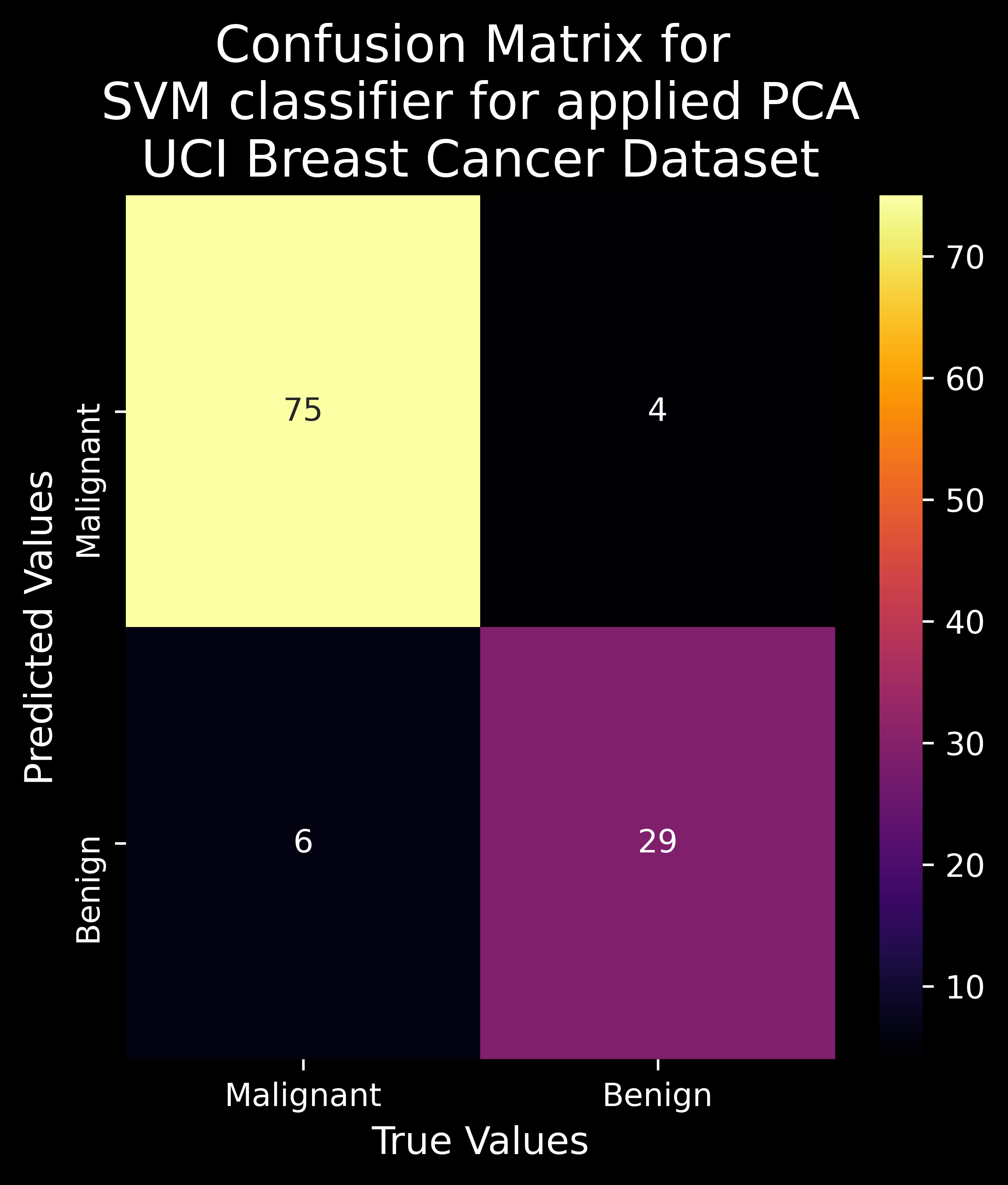
def get_SVM_params(weights,bias,features):
  """Pretty Print the Features with the Model Parameters"""
  text = " "
  for w, x in zip (weights, features) :
    text +=  " + " + str(w)+" * "+ str(x)
  text += " - "+ str(float(bias)) + " = 0 "
  return text

points_to_round=3                                          # points to round off to
w = best_clf.coef_.flatten().round(points_to_round)        # get the weight vector - normal vector to the hyperplane
b = best_clf.intercept_.flatten().round(points_to_round)   # get the bias vector - distance from the origin
PCA_dim=2                                                  # the PCA number of components
features=['PCA'+str(i+1) for i in range(PCA_dim) ]         # prepare labels
print(get_SVM_params(weights=w,bias=b,features=features))  # get the SVM parameters
+ 0.007 * PCA1 + -0.017 * PCA2 - 0.538 = 0
Finding the Optimal Model Hyperparameters :
Often Machine Learning Engineers , use search algorithms such as GridSearchCV and RandomizedSearchCV to perform model hyperparameter fine tuning for optimal performance of the predictor. However, the implementation and detailed explaianation of these algorithms are beyond the scope of this book chapter.
2.3.20 Limitations of PCA
Although PCA is a widely used algorithm for dimensionality reduction, it has its own limitations :
- PCA is a Linear Dimensionality Reduction Algorithm and hence chooses an eigenvector with a corresponding high eigenvalue. In some cases in the form of highly non linear data spaces, this approach will fail as the NON LINEAR COMPONENTS will be TRUNCATED (disregarded as noise) and will not count towards the model variance a lot. It assumes that a large variance results in a low covariance, which in turn implies high importance which may not be true 100% of the times. For this we need to shift to Kernel PCA (KPCA) which requires a lot of space.
- PCA is a SCALE VARIANT Algorithm, and hence any change of scale in any of the variables will affect the PCA values accordingly.
- For some data distributions, MEAN & COVARIANCE DESCRIPTION IS INACCURATE. It is only true to say that for the Gaussian/Normal Data Distributions, this algorithm performs actually well, but this may not be correct for other distributions.
2.3.21 PCA vs. t-SNE
| PCA | T-SNE |
|---|---|
| Linear Dimensionality Reduction Technique. | Non-Linear Dimensionality Reduction Technique. |
| Captures Global Structure of the Data Distribution (Covariance). | Preserves Local Structure of the Data Distribution (Cluster). |
| Does not generalize well as compared to t-SNE. | One of the best generalized dimensionality reduction techniques. |
| Model Hyperparameters not Involved. | Model Hyperparameters - perplexity, learning rate and number of steps. |
| Highly affected by data noise/outliers. | Handle outliers efficiently. |
| Deterministic algorithm. | Non-deterministic or randomised algorithm. |
| Rotates the vectors for preserving variance. | Minimizes the distance between the points in a Gaussian distributution. |
Conclusion
In this chapter, we applied the concepts of dimensionality reduction in applied machine learning on various datasets. The authors recommend to try out other datasets as well to practice & get a firm understanding of the algorithms used in this chapter for reducing high dimensionality datasets. Some reliable data sources are as follows :